Over the past few months, I've been working with Brandon Jacoby and the team at Bravo Juliet on the visual identity for a new coaching company I'm launching this fall.
I've come to believe that the best brand work has very little to do with logos.
It begins with questions.
Who are we becoming? What do we believe? What should people feel before they understand?
Brandon has a remarkable ability to listen beneath the surface. Rather than rushing toward visual concepts, he kept pulling us back to first principles.
"Identity should clarify, not decorate."
That idea became a compass for the entire project.
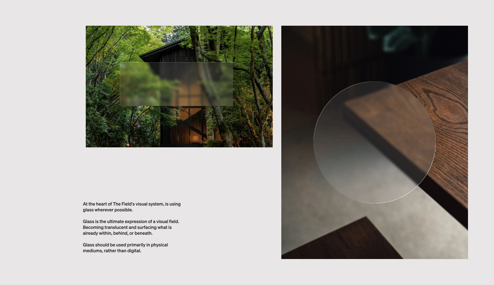
One concept that immediately resonated was the use of glass throughout the visual system.
Glass reveals rather than hides. It softens edges. It allows what's already present to come into view.
For a coaching practice centered on awareness and transformation, it felt like more than a design choice. It felt like a metaphor.
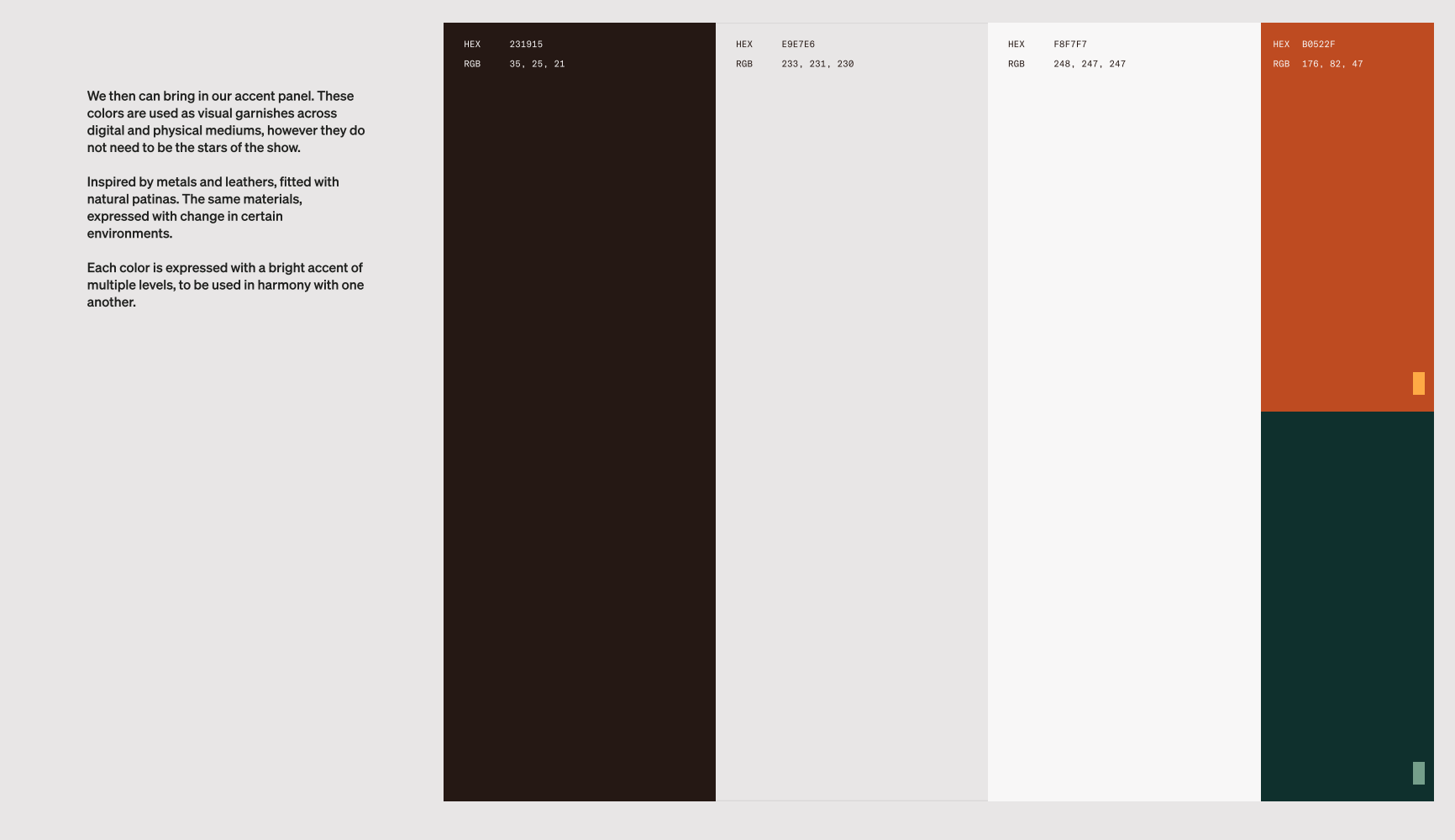
The palette followed the same philosophy.
Earth instead of trend.
Warmth instead of polish.
Confidence without shouting.
Nothing was chosen simply because it looked beautiful. Every decision had to earn its place.
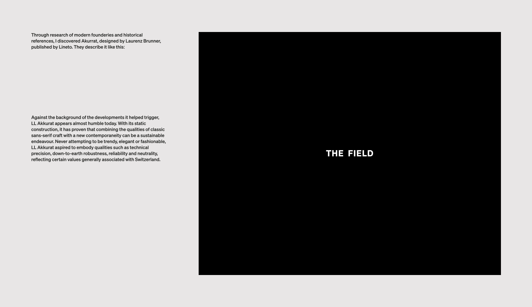
Typography became another expression of the same idea.
We landed on LL Akkurat, a typeface that feels quiet, grounded, and enduring. It's not trying to impress you. It simply does its job exceptionally well.
That restraint felt right.
The work isn't finished yet.
There are still decisions to make, pages to design, and details to refine.
But somewhere along the way, this stopped feeling like "branding."
It became an exercise in alignment.
When the identity is clear, every other decision gets a little easier.
I'm looking forward to sharing more as this takes shape.